Retail · Rebrand
Kiln
Repositioning a legacy homeware retailer as the design-literate choice for a younger buyer.
- Positioning
- Identity
- Retail
Introduction
A legacy homeware retailer, re-cut for a younger buyer.
Challenge
Kiln had forty years of craft credibility and a customer base ageing out of the category. Growth was flat, discounting was constant, and every new collection was judged against a catalogue nobody under forty was reading.
Research
We interviewed 24 lapsed and prospective buyers, audited 11 competitors across price tiers, and pulled three years of transaction data. The finding was uncomfortable: people liked the products and could not tell you a single thing the brand believed.
Positioning
Kiln became the design-literate homeware brand — objects made to be used daily, explained by people who know why they were made that way. Craft as evidence, not as nostalgia.
Identity
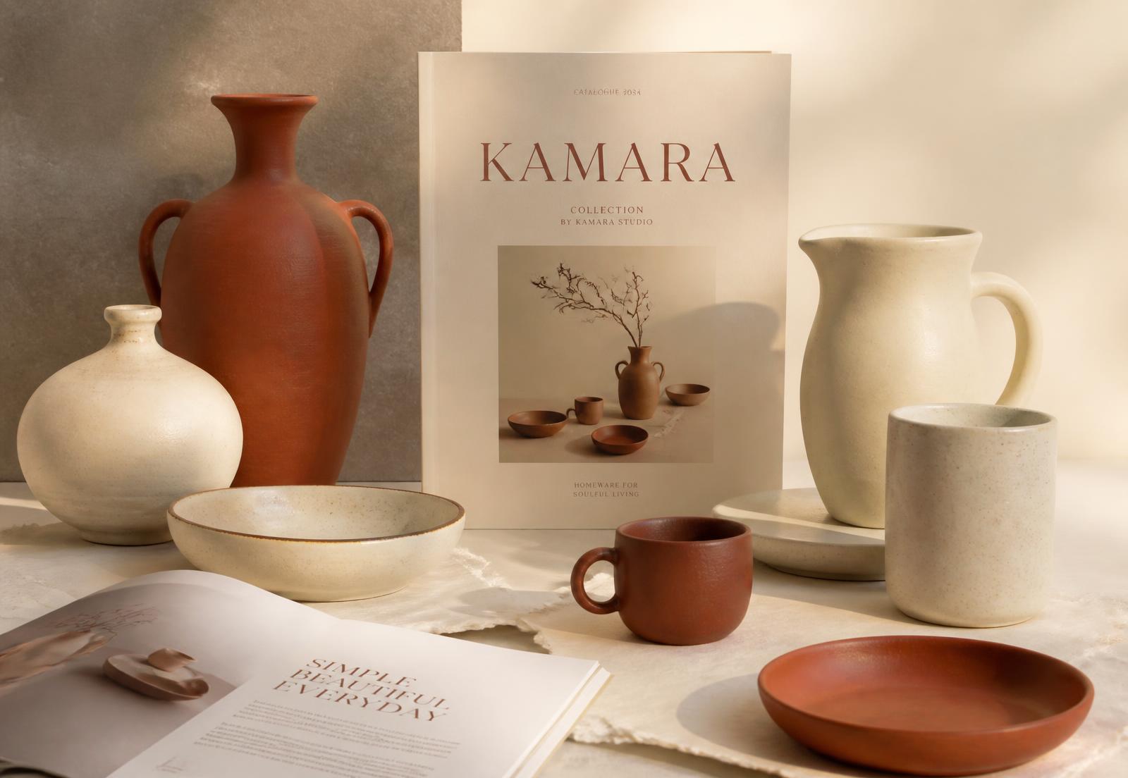
A quieter wordmark, a warm terracotta and cream palette drawn from the glazes themselves, and an editorial type system that lets the product photography carry the emotion.
Applications
Packaging, in-store signage, a rebuilt catalogue as a seasonal editorial object, and a photography direction that shoots product in use rather than in isolation.
Key learnings
Heritage brands rarely need to sound younger. They need to say what they know, plainly, in a register the next buyer respects.
Outcome
- +38% direct-to-consumer revenue in two quarters
- Average order value up 21%
- Discount-led sales down from 46% to 19%
Next project →
Fettle